


TOOLS: FIGMA
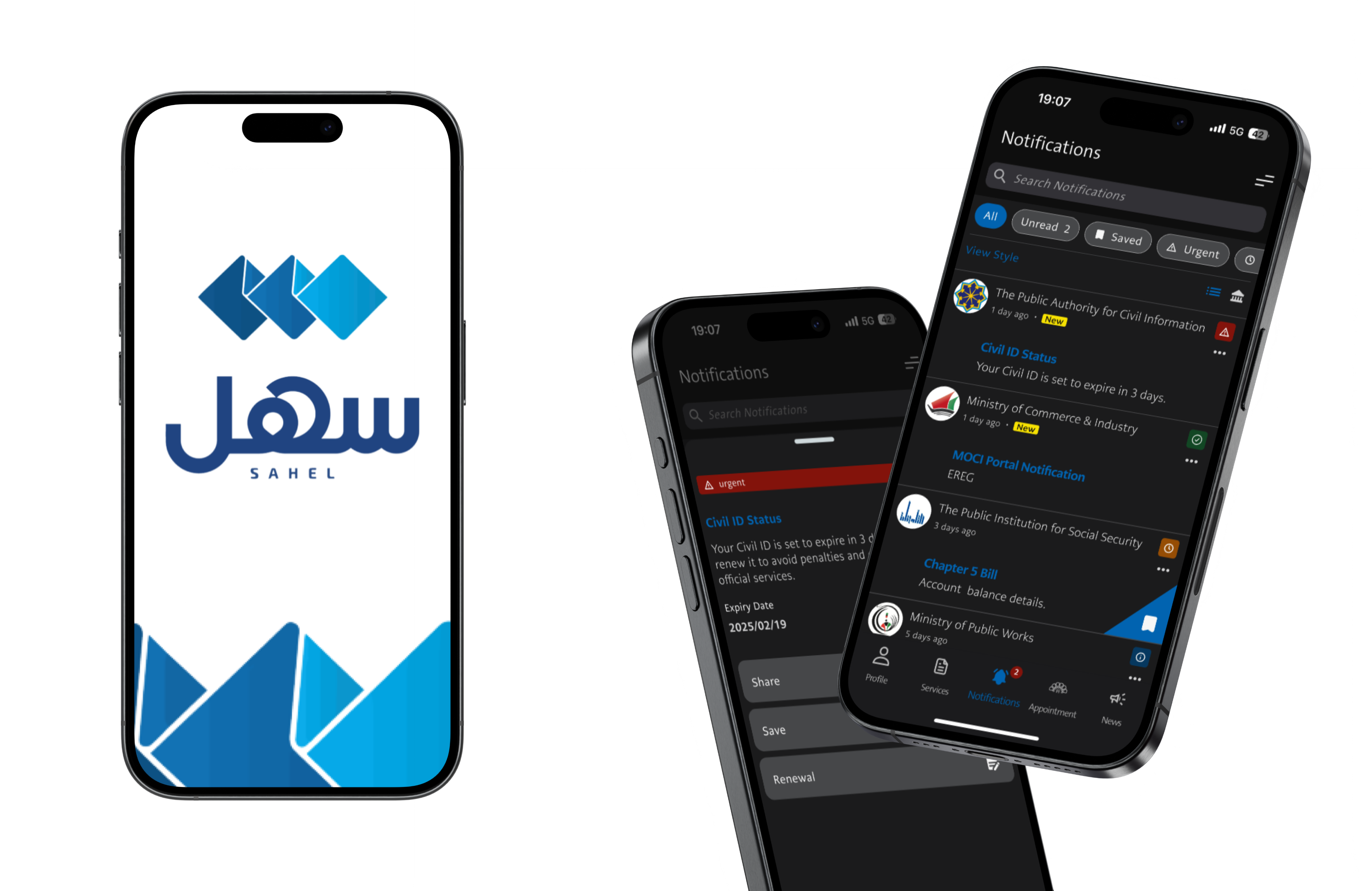
SAHEL NOTIFICATION SYSTEM REDESIGN
OVERVIEW
Sahel is Kuwait’s official government services app, used for everything from civil ID updates to bill payments. While the platform is well-structured overall, the notification system lacked clarity, prioritization, and user control — especially for high-frequency users managing multiple services.
This is an unofficial redesign created independently as a personal UX exploration.
This redesign improves the user experience by addressing core usability issues through better hierarchy, clearer categorization, and streamlined interaction patterns.
Problem
THE EXISTING NOTIFICATION SYSTEM:
-
Treated all messages equally (no visual urgency)
-
Mixed updates from multiple ministries without filters
-
Offered no way to quickly act on a task or reference it later
-
Used vague or overly formal language that reduced clarity
GOALS
-
Help users quickly understand what needs action
-
Enable users to filter and organize notifications
-
Make actionable notifications easier to respond to
-
Keep the visual design consistent with the current app in dark mode
UX IMPROVEMENTS IMPLEMENTED
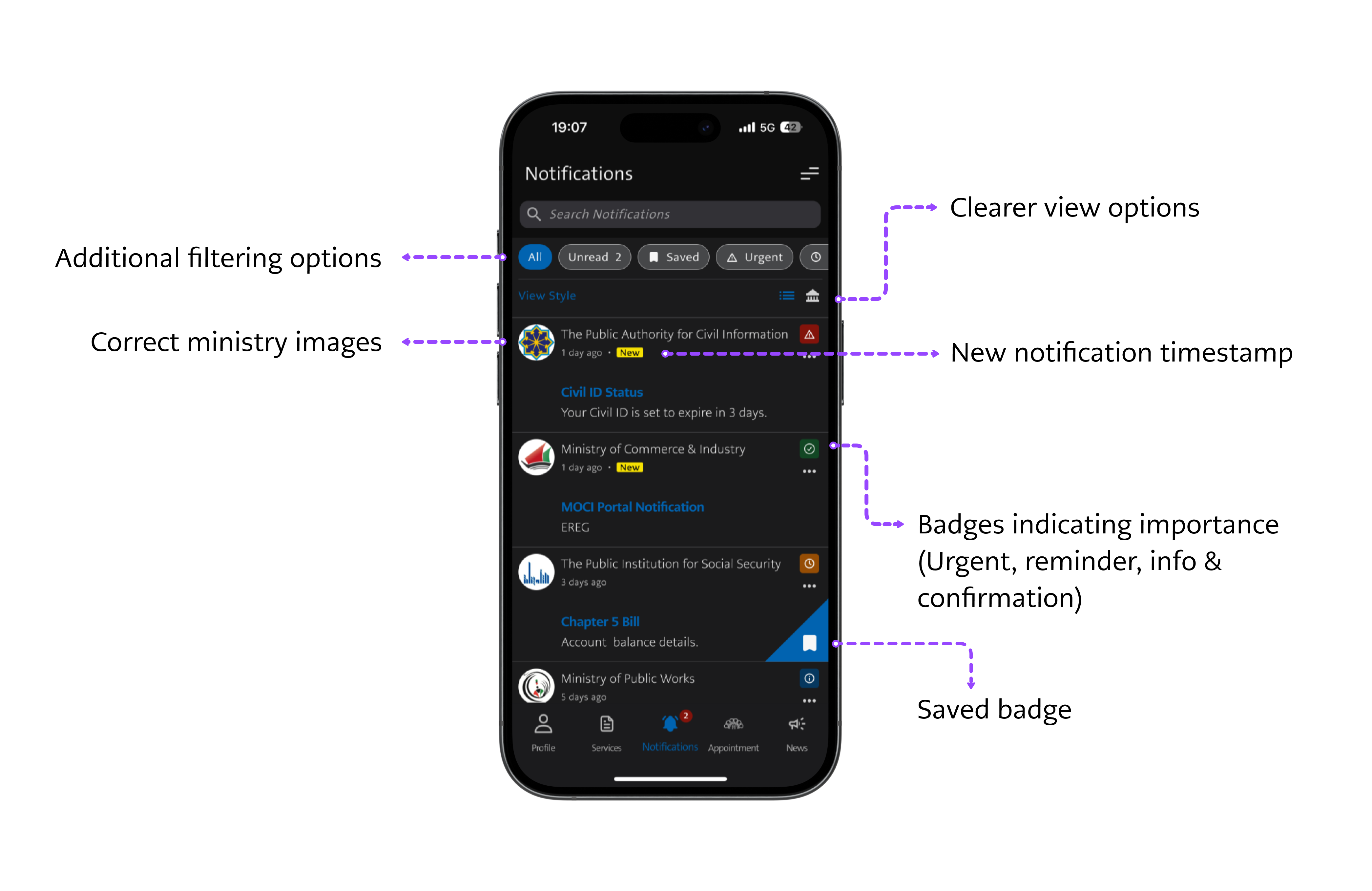
1. Notification List Redesign
Changes Made:
-
Introduced importance badges: Urgent, Reminder, Info, and Confirmation
-
Added filtering options (All, Unread, Saved, Urgent) above the list
-
Used correct ministry logos to improve message clarity
-
Introduced a "New" label next to timestamps for unread items
-
Allowed users to toggle between list and tile views for better browsing
WHY THIS MATTERS: Users can now scan notifications more efficiently, prioritize what to do next, and feel confident they're not missing important tasks.
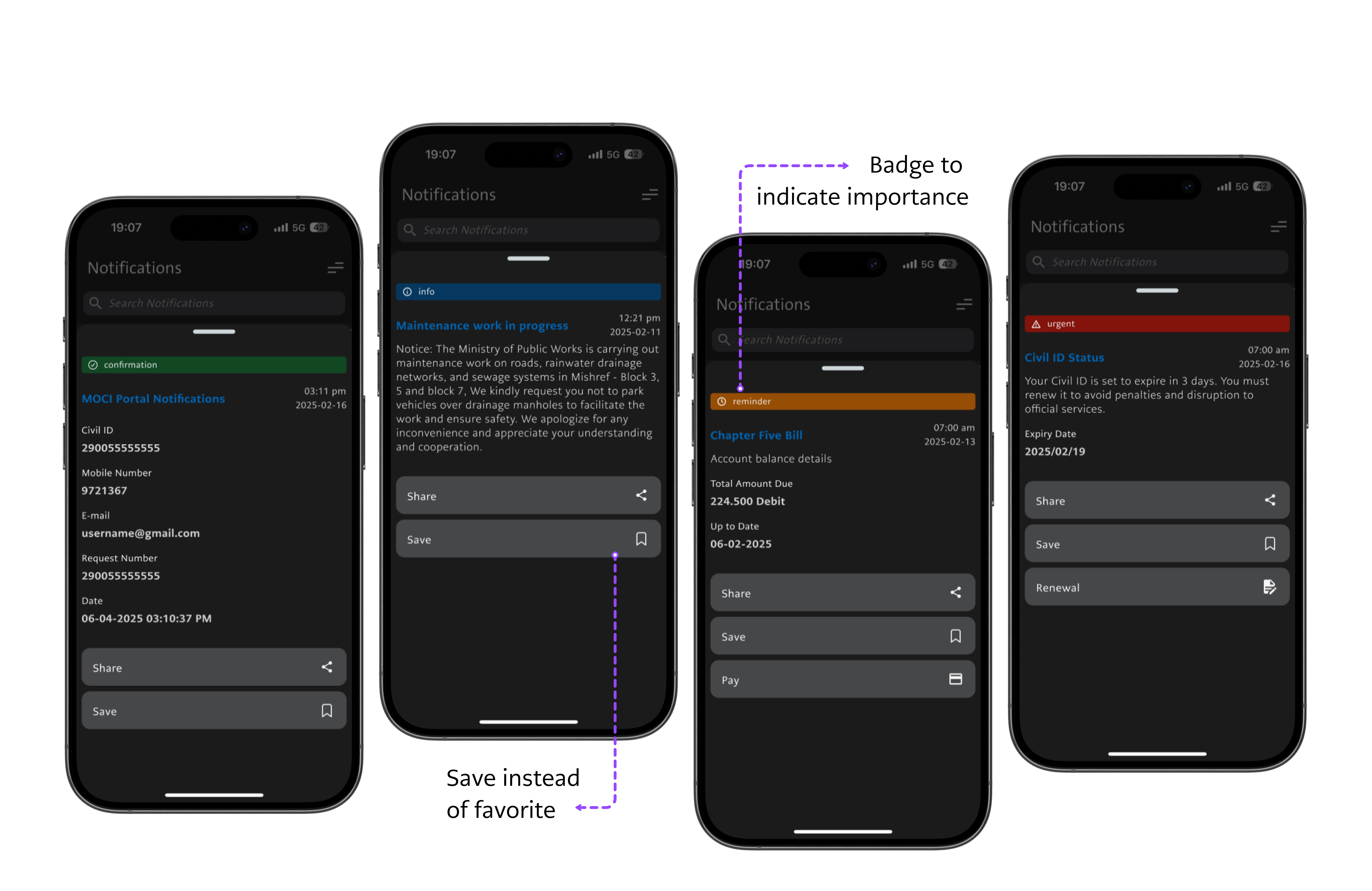
2. Notification Detail Views
Changes Made:
-
Replaced the ambiguous “Favorite” button with a clearer “Save” action to better reflect user intent
-
Standardized layout across notification types for visual consistency
-
Aligned with existing Sahel features by retaining built-in action buttons like “Pay” and “Renew,” but ensured they are better contextualized with the notification type (Urgent, Reminder, etc.)
WHY THIS MATTERS: By improving terminology and layout while respecting the existing functionality, this redesign makes the notification experience more consistent and user-friendly without disrupting the core app logic.
SCREENS IN THE MOCKUP
Screen: Main Notifications List
Key UX Improvement: Badge system, filtering tabs, “New” labels, correct ministry icons
Screen: Urgent Notification (Red)
Key UX Improvement: Clear visual urgency, action button for “Renewal”, timestamp and expiry date
Screen: Reminder Notification (Orange)
Key UX Improvement: Upcoming bill notice with “Pay” action, neutral tone
Screen: Info Notification (Blue)
Key UX Improvement: Passive update with no CTA, styled for quick skimming
Screen: Confirmation (Green)
Key UX Improvement: Visual confirmation of completed actions (e.g., profile update), no further steps required
UX BEST PRACTICES APPLIED
-
Clear visual hierarchy using badges, spacing, and icons
-
Micro-interactions optimized (Save vs. Favorite, contextual CTAs)
-
Pattern inspiration from banking and ID apps (Apple Wallet, Google Pay)
-
Design respects existing typography, spacing, and color palette in Sahel’s dark mode
OUTCOME
This redesign offers a cleaner, faster, and more actionable notification experience that better supports citizens using Sahel for time-sensitive government tasks — all while blending seamlessly into the app’s existing design system.