


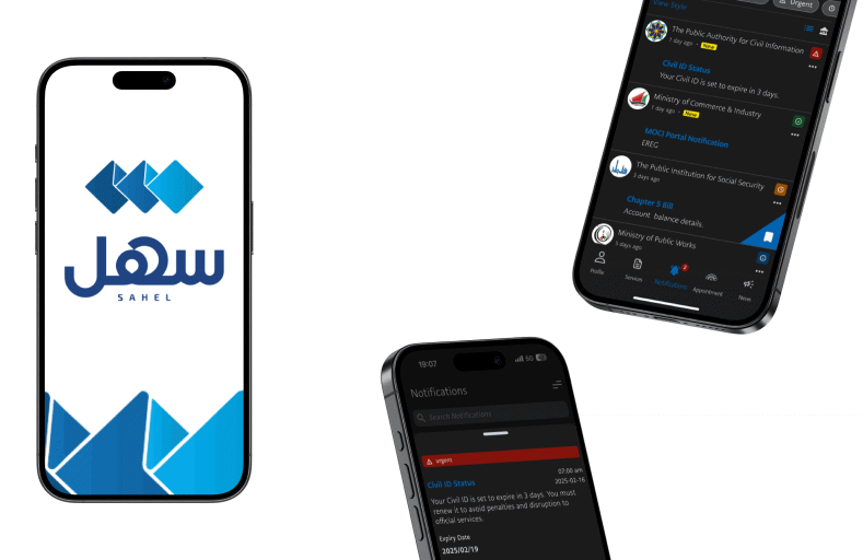
NOTIFICATION SYSTEM REDESIGN FOR SAHEL APP (UX CASE STUDY)
UI/UX
NOTIFICATION SYSTEM REDESIGN FOR SAHEL APP (UX CASE STUDY)
UI/UX
OVERVIEW
Sahel is Kuwait’s official government services app, used for everything from civil ID updates to bill payments. While the platform is well-structured overall, the notification system lacked clarity, prioritization, and user control — especially for high-frequency users managing multiple services.
Sahel is Kuwait’s official government services app, used for everything from civil ID updates to bill payments. While the platform is well-structured overall, the notification system lacked clarity, prioritization, and user control — especially for high-frequency users managing multiple services.
This is an unofficial redesign created independently as a personal UX exploration.
This redesign improves the user experience by addressing core usability issues through better hierarchy, clearer categorization, and streamlined interaction patterns.
PROBLEM
The existing notification system:
Treated all messages equally (no visual urgency)
Mixed updates from multiple ministries without filters
Offered no way to quickly act on a task or reference it later
Used vague or overly formal language that reduced clarity
GOALS
Help users quickly understand what needs action
Enable users to filter and organize notifications
Make actionable notifications easier to respond to
Keep the visual design consistent with the current app in dark mode
UX IPROVEMENTS IMPLEMENTED
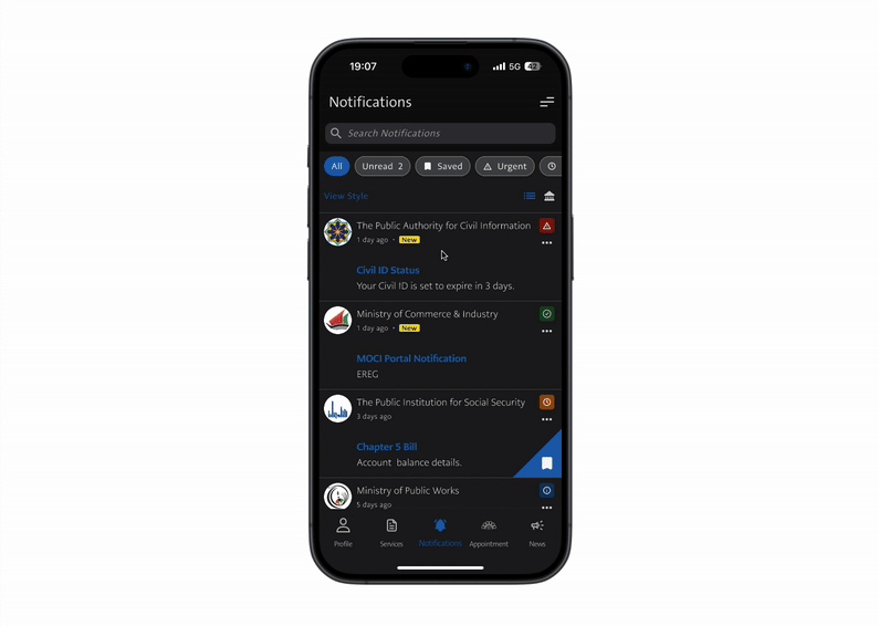
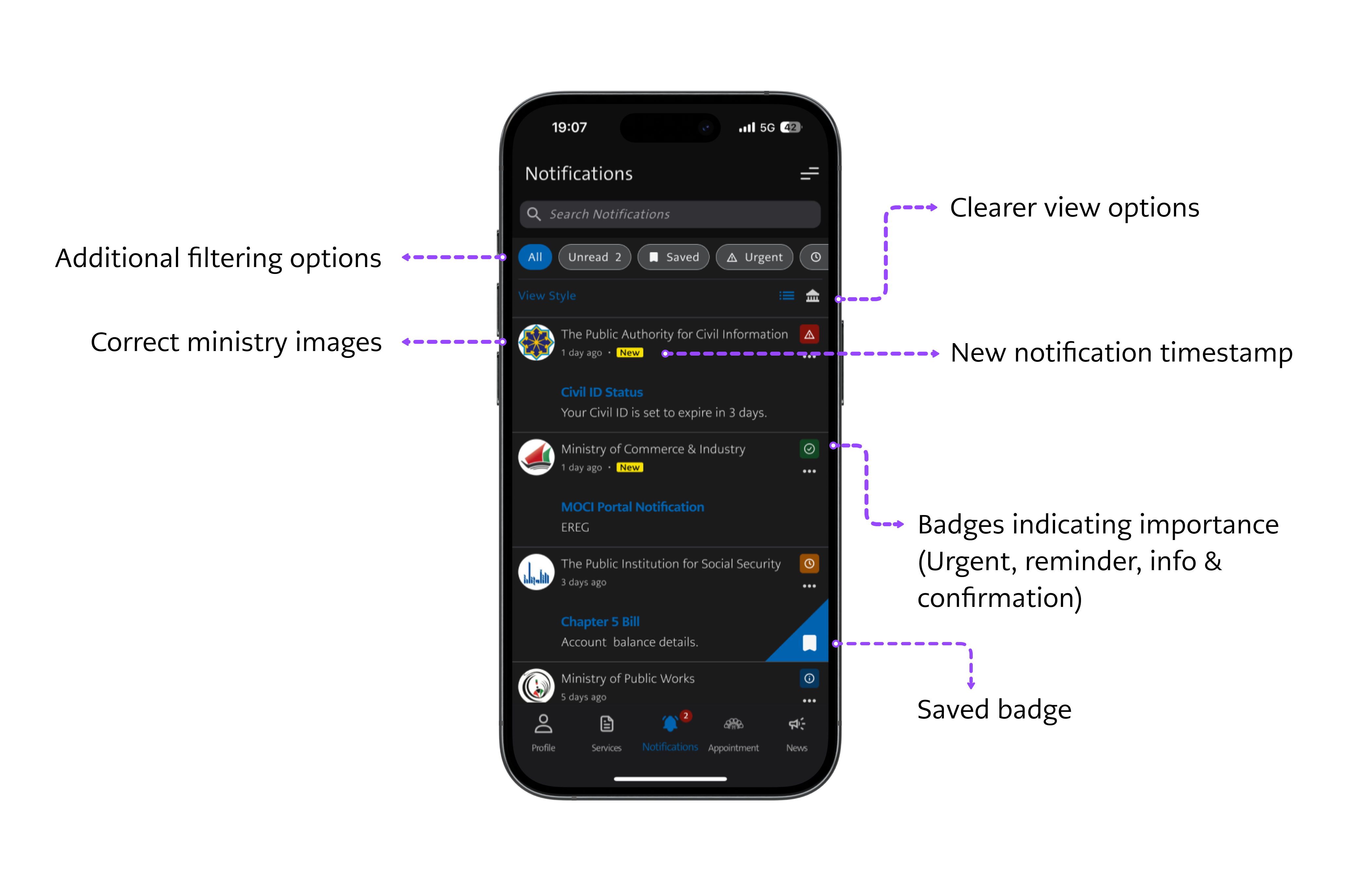
1. NOTIFICATION LIST
Changes Made:
Introduced importance badges: Urgent, Reminder, Info, and Confirmation
Added filtering options (All, Unread, Saved, Urgent) above the list
Used correct ministry logos to improve message clarity
Introduced a "New" label next to timestamps for unread items
✦ Why this matters: Users can now scan notifications more efficiently, prioritize what to do next, and feel confident they're not missing important tasks.
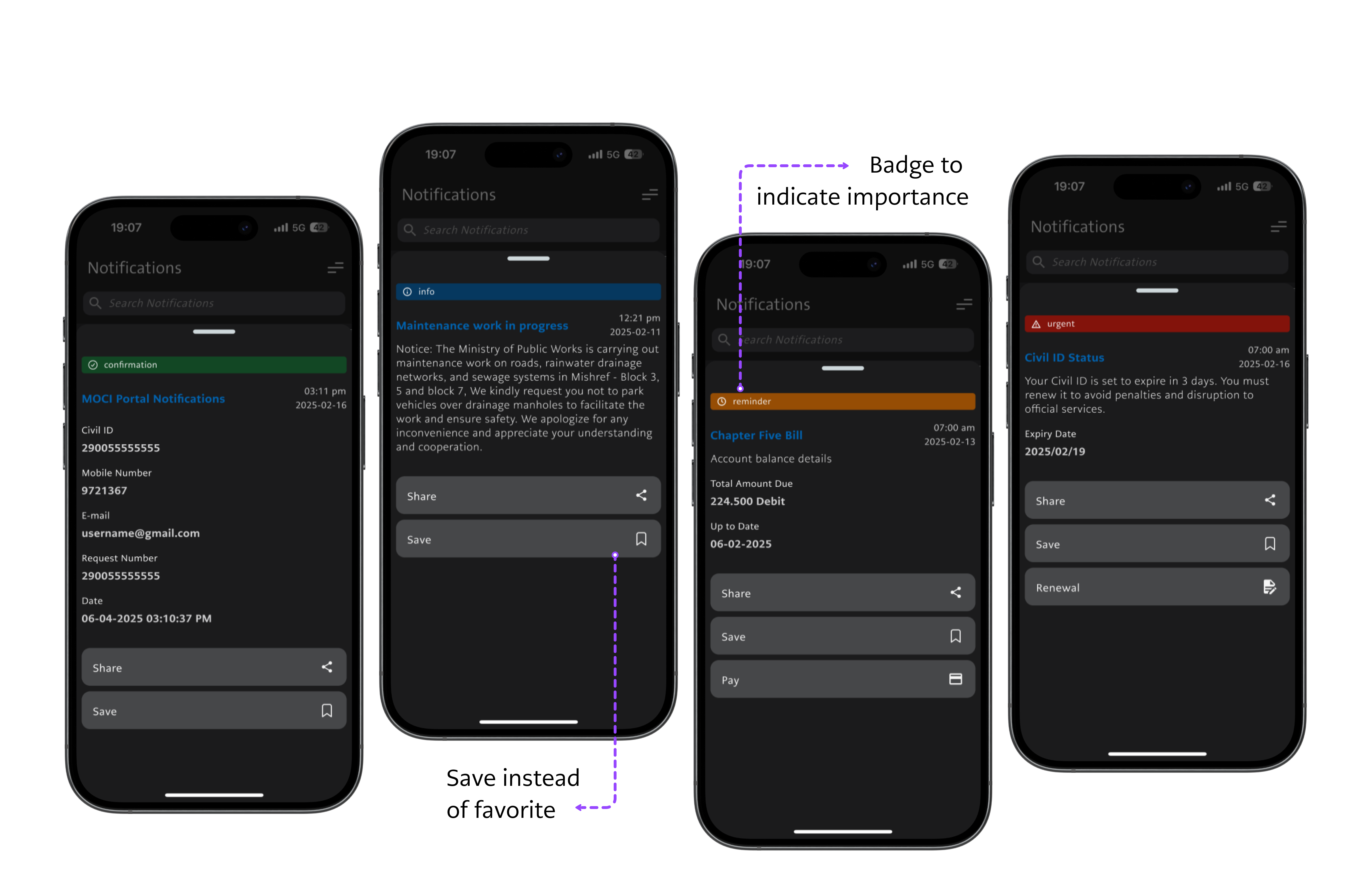
2. NOTIFICATION DETAIL
Changes Made:
Replaced the ambiguous “Favorite” button with a clearer “Save” action to better reflect user intent.
Standardized layout across notification types for visual consistency.
Aligned with existing Sahel features,” but ensured they are better contextualized with the notification type (Urgent, Reminder, etc.).
✦ Why this matters: By improving terminology and layout while respecting the existing functionality, this redesign makes the notification experience more consistent and user-friendly without disrupting the core app logic.
UX BEST PRACTICES APPLIED
Clear visual hierarchy using badges, spacing, and icons
Micro-interactions optimized (Save vs. Favorite, contextual CTAs)
Pattern inspiration from banking and ID apps (Apple Wallet, Google Pay)
Design respects existing typography, spacing, and color palette in Sahel’s dark mode
OUTCOME
This redesign offers a cleaner, faster, and more actionable notification experience that better supports citizens using Sahel for time-sensitive government tasks — all while blending seamlessly into the app’s existing design system.
Treated all messages equally (no visual urgency)
Mixed updates from multiple ministries without filters
Offered no way to quickly act on a task or reference it later
Used vague or overly formal language that reduced clarity
GOALS
Help users quickly understand what needs action
Enable users to filter and organize notifications
Make actionable notifications easier to respond to
Keep the visual design consistent with the current app in dark mode
UX IPROVEMENTS IMPLEMENTED
1. NOTIFICATION LIST
Changes Made:
Introduced importance badges: Urgent, Reminder, Info, and Confirmation
Added filtering options (All, Unread, Saved, Urgent) above the list
Used correct ministry logos to improve message clarity
Introduced a "New" label next to timestamps for unread items
✦ Why this matters: Users can now scan notifications more efficiently, prioritize what to do next, and feel confident they're not missing important tasks.
2. NOTIFICATION DETAIL
Changes Made:
Replaced the ambiguous “Favorite” button with a clearer “Save” action to better reflect user intent.
Standardized layout across notification types for visual consistency.
Aligned with existing Sahel features,” but ensured they are better contextualized with the notification type (Urgent, Reminder, etc.).
✦ Why this matters: By improving terminology and layout while respecting the existing functionality, this redesign makes the notification experience more consistent and user-friendly without disrupting the core app logic.
UX BEST PRACTICES APPLIED
Clear visual hierarchy using badges, spacing, and icons
Micro-interactions optimized (Save vs. Favorite, contextual CTAs)
Pattern inspiration from banking and ID apps (Apple Wallet, Google Pay)
Design respects existing typography, spacing, and color palette in Sahel’s dark mode
OUTCOME
This redesign offers a cleaner, faster, and more actionable notification experience that better supports citizens using Sahel for time-sensitive government tasks — all while blending seamlessly into the app’s existing design system.
TOOLS: FIGMA